Categories
Blog

The Future of IPEDS: Navigating Uncertainty with Datatelligent 

For years, the Integrated Postsecondary Education Data System (IPEDS) has served as a cornerstone of information for the higher education community. This comprehensive database provides invaluable data on everything from enrollment and graduation rates to financial aid and institutional characteristics. However, recent developments have raised concerns about the long-term future and accessibility of this vital resource. 

One of the most pressing issues currently facing IPEDS is the potential for decreased federal funding. As reported by Inside Higher Ed regarding potential cuts to the National Center for Education Statistics (NCES) (which oversees IPEDS), proposed budget cuts could significantly impact the resources allocated to data collection and maintenance. While the future remains uncertain, the possibility of reduced funding introduces a level of instability that institutions need to consider. 

Beyond budgetary concerns, other factors could potentially impact the future of IPEDS in its current form. Shifts in federal priorities, evolving data needs within the higher education sector, or even the emergence of alternative data collection systems could lead to changes in how postsecondary data is gathered and disseminated. 

Recognizing this potential uncertainty, Datatelligent has proactively developed solutions to ensure that institutions continue to have access to the critical IPEDS data they rely on. 

Introducing Datatelligent’s IPEDS Solutions: Stability in an Evolving Landscape 

We understand the vital role IPEDS data plays in institutional planning, benchmarking, and decision-making. That’s why we’re proud to offer two powerful tools that provide a reliable alternative, regardless of what the future holds for the government-hosted IPEDS database: 

  • Datatelligent’s Free IPEDS Comparison Tool: Our newly launched comparison tool provides an accessible way to analyze enrollment trends and benchmark your institution against peers using a local copy of IPEDS data. Even if the public IPEDS database were to become unavailable, our comparison tool will continue to function, providing you with essential insights. Explore the free tool here: Datatelligent Enrollment Comparison Tool
  • Datatelligent’s IPEDS Assistant: For institutions requiring more in-depth analysis and customized reporting, our IPEDS Assistant offers a robust solution. This comprehensive tool leverages our maintained local copy of IPEDS data, allowing for advanced comparisons, automated data pulls, and the creation of tailored reports to meet your specific needs. While the Comparison Tool is free, the IPEDS Assistant provides a more extensive suite of features for a subscription fee, ensuring continued access to comprehensive IPEDS data and analysis capabilities. Learn more about the IPEDS Assistant here: Datatelligent IPEDS Assistant

Our commitment is to provide the higher education community with reliable access to crucial data. By maintaining our own comprehensive copy of IPEDS data, we are ensuring that this valuable resource remains available to you, empowering your institution to navigate the future with confidence. 

If you have any questions about our IPEDS Comparison Tool, the IPEDS Assistant, or how Datatelligent can support your institution’s data needs, please don’t hesitate to get in touch. You can reach our team through our contact page: Datatelligent Contact Us. We are here to help you navigate the evolving data landscape. 
Categories
Blog Uncategorized

Introducing Datatelligent’s Free IPEDS Enrollment Comparison Tool: Your Key to Unlocking Enrollment Insights 

We are thrilled to announce the launch of Datatelligent’s new IPEDS Enrollment Comparison Tool, now available to you free of charge! This powerful tool is designed to help institutions easily explore enrollment trends and benchmark performance using comprehensive IPEDS data. You can access the tool and start your analysis today at Datatelligent Enrollment Comparison Tool

How to Easily Use Your New Tool 

Getting started with the IPEDS Comparison Tool is simple and intuitive. For a visual guide, be sure to watch our detailed video tutorial: Datatelligent IPEDS Enrollment Comparison Tool Tutorial

Here are the quick steps to begin your comparison: 

  1. Select a School: In the top-left dropdown menu, click to expand the list. You can then use the search bar to quickly find your desired college by name. 
  1. Run Comparison: Once you select a school, the data comparison automatically runs, leveraging up-to-date IPEDS data. 
  1. Compare Multiple Institutions: The tool allows you to compare as many schools as you wish, providing instant insights into various enrollment metrics. You can view the percent change in enrollment over six years, graph enrollment headcount, and compare schools within the same sector, level, and region. The dashboard quickly shows six-year changes in student degree level, student intensity, and degree-seeking status. 

Benchmark Performance Against Your Peers 

Our comparison tool is exceptionally good for comparing your institution to peer schools. The chart automatically displays a trend line on your graph for similar colleges in your area, making it an excellent resource for benchmarking your performance against comparable institutions. This feature helps you quickly identify how your enrollment trends align with, or diverge from, those of your peers. 

Ensuring Your Data Future 

In an uncertain landscape where IPEDS data availability could be affected by government funding changes, Datatelligent provides a robust solution. We maintain a local copy of the IPEDS data, ensuring that you will continue to have access to this critical information even if the official IPEDS database becomes unavailable. We will be releasing a separate, in-depth article on this topic soon. 

Just a Taste of What We Offer 

While this free IPEDS Comparison Tool offers valuable insights, it’s only a glimpse of our full suite of capabilities. Datatelligent offers a comprehensive IPEDS Assistant, an advanced tooling solution that can automatically pull IPEDS data for you and perform a multitude of more complex comparisons tailored to your specific needs. To explore the full range of our offerings, visit our IPEDS Assistant Solutions Page. We encourage you to get in contact with us to learn more about how our advanced tools can empower your institution. 

Join Our Upcoming Webinar 

Have questions or want to see a live demonstration of the tool and our broader capabilities? We have a webinar coming up soon! Sign up here to secure your spot and gain further insights: Webinar Registration

Categories
Blog

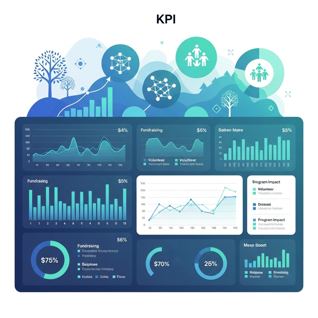
Powering Purpose: A Nonprofit’s Guide to Live KPI Dashboards

Chicago, IL – For our community’s vibrant non-profit sector, the mission is everything. But in a competitive landscape, proving impact and operating efficiently requires more than just passion—it requires data. At Datatelligent, we believe that a live Key Performance Indicator (KPI) dashboard is one of the most powerful tools for nonprofits to transform their data into decisive action, ensuring every effort and dollar is maximized for impact.

Here’s a look at sample KPIs we recommend for a dashboard, designed to provide a real-time pulse on your organization’s health and outreach.

I. Fundraising, Grants, and Earned Revenue

Track your revenue streams in real-time to ensure the financial sustainability of your nonprofit.

KPILive Chart IdeasWhy It’s Valuable in Real Time
Total Revenue to BudgetGauge ChartShow progress to goal in real time, motivating teams to work toward the shared goal.
New, Returning & Sustaining Donors Stacked Bar Instantly see if your campaigns are attracting and retaining support. Allows re-focus on specific donor groups.
Funding by Channel or TypeTree Map or Pie ChartSee the overall makeup of the funding portfolio to pivot strategy–especially if overly dependent on a source. 

II. Program & Impact

Keep your mission at the forefront by visualizing the direct impact of your work.

KPILive Chart IdeasWhy It’s Valuable in Real Time
Total Clients Served and Total Service Units DeliveredNumber Cards Line Graph with Year Over Year ComparisonGet a powerful, at-a-glance count of your unduplicated served. Provide real-time illustration of changes happening in the communityOn Number Cards, add Up and Down arrows for Point-in-Time comparison for prior year.
Program Service Units Delivered Bar Chart with hash marks with progress to goal or
Heat Map by Zip, County, or State 
Track program output progress to goal and quickly identify areas needing more attention or where need exceeds capacity.
Client Pulse SurveySmiley-face GaugeGain a quick check on beneficiary satisfaction.

III. Volunteer, Supporter, & Advocate Engagement

Engage your community and amplify your message by tracking the metrics that matter most.

KPILive Chart IdeasWhy It’s Valuable in Real Time
Total # of Volunteers and Hours Volunteered Number Cards Line Graph or Bar Chart with Year Over Year ComparisonGet a powerful, at-a-glance count of your volunteers and their hours. Add a calculation of the value of volunteer hours for more impact. Use a line graph or bar chart with year-over-year comparison. Calculate the average hours contributed per month to challenge volunteers to “level up” and give more or recruit a friend.
Communications Metrics (newsletter, text campaigns)Funnel ChartIllustrate your total sent, open, click, take action numbers and rates. Monitor against industry benchmarks or your own targets to assess the most effective content and channel.
Social Media Engagement Line Chart or Stacked BarPie ChartGet a quick pulse on what content resonates with your audience (reach),  how engaging it is (engagement rate), and by what channel .A simple pie chart can show the breakdown of Likes, Shares, and Comments.
Total # of Advocates and # of Advocacy Actions TakenNumber Cards or
Heat Map
Get a powerful, at-a-glance count of your advocates and their actions.  Display the geographic distribution of your advocates and their actions. Target specific geographic areas based on the advocacy campaign. 

From Data to Decisions: How Datatelligent Can Help

Seeing these KPIs in a live dashboard is transformative, but we know the biggest challenge for most nonprofits is that the data lives in disconnected systems. Your donor or client information may be in a CRM, volunteers are in another software, website analytics are in a separate platform, and staff maintain various spreadsheets. This is where Datatelligent steps in.

Our Unified Data Solutions are designed specifically to solve this problem. We specialize in breaking down these data silos. Our process involves consolidating disparate data sources into a single, easy-to-use data lake.

By creating one unified source of truth, we make the creation of powerful, live KPI dashboards fast and straightforward. Instead of staff spending hours on manual data pulls each week, month, or quarter, your team gets instant access to the insights that matter. We handle the entire data pipeline, from integration to visualization, empowering you to focus on what you do best: driving your mission forward. Let us help you turn your data into your greatest asset.

Latest News
Days
Hours
Minutes