Chicago, IL – For our community’s vibrant non-profit sector, the mission is everything. But in a competitive landscape, proving impact and operating efficiently requires more than just passion—it requires data. At Datatelligent, we believe that a live Key Performance Indicator (KPI) dashboard is one of the most powerful tools for nonprofits to transform their data into decisive action, ensuring every effort and dollar is maximized for impact.
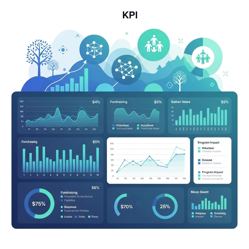
Here’s a look at sample KPIs we recommend for a dashboard, designed to provide a real-time pulse on your organization’s health and outreach.
I. Fundraising, Grants, and Earned Revenue
Track your revenue streams in real-time to ensure the financial sustainability of your nonprofit.
| KPI | Live Chart Ideas | Why It’s Valuable in Real Time |
| Total Revenue to Budget | Gauge Chart | Show progress to goal in real time, motivating teams to work toward the shared goal. |
| New, Returning & Sustaining Donors | Stacked Bar | Instantly see if your campaigns are attracting and retaining support. Allows re-focus on specific donor groups. |
| Funding by Channel or Type | Tree Map or Pie Chart | See the overall makeup of the funding portfolio to pivot strategy–especially if overly dependent on a source. |
II. Program & Impact
Keep your mission at the forefront by visualizing the direct impact of your work.
| KPI | Live Chart Ideas | Why It’s Valuable in Real Time |
| Total Clients Served and Total Service Units Delivered | Number Cards Line Graph with Year Over Year Comparison | Get a powerful, at-a-glance count of your unduplicated served. Provide real-time illustration of changes happening in the communityOn Number Cards, add Up and Down arrows for Point-in-Time comparison for prior year. |
| Program Service Units Delivered | Bar Chart with hash marks with progress to goal or Heat Map by Zip, County, or State | Track program output progress to goal and quickly identify areas needing more attention or where need exceeds capacity. |
| Client Pulse Survey | Smiley-face Gauge | Gain a quick check on beneficiary satisfaction. |
III. Volunteer, Supporter, & Advocate Engagement
Engage your community and amplify your message by tracking the metrics that matter most.
| KPI | Live Chart Ideas | Why It’s Valuable in Real Time |
| Total # of Volunteers and Hours Volunteered | Number Cards Line Graph or Bar Chart with Year Over Year Comparison | Get a powerful, at-a-glance count of your volunteers and their hours. Add a calculation of the value of volunteer hours for more impact. Use a line graph or bar chart with year-over-year comparison. Calculate the average hours contributed per month to challenge volunteers to “level up” and give more or recruit a friend. |
| Communications Metrics (newsletter, text campaigns) | Funnel Chart | Illustrate your total sent, open, click, take action numbers and rates. Monitor against industry benchmarks or your own targets to assess the most effective content and channel. |
| Social Media Engagement | Line Chart or Stacked BarPie Chart | Get a quick pulse on what content resonates with your audience (reach), how engaging it is (engagement rate), and by what channel .A simple pie chart can show the breakdown of Likes, Shares, and Comments. |
| Total # of Advocates and # of Advocacy Actions Taken | Number Cards or Heat Map | Get a powerful, at-a-glance count of your advocates and their actions. Display the geographic distribution of your advocates and their actions. Target specific geographic areas based on the advocacy campaign. |
From Data to Decisions: How Datatelligent Can Help
Seeing these KPIs in a live dashboard is transformative, but we know the biggest challenge for most nonprofits is that the data lives in disconnected systems. Your donor or client information may be in a CRM, volunteers are in another software, website analytics are in a separate platform, and staff maintain various spreadsheets. This is where Datatelligent steps in.
Our Unified Data Solutions are designed specifically to solve this problem. We specialize in breaking down these data silos. Our process involves consolidating disparate data sources into a single, easy-to-use data lake.
By creating one unified source of truth, we make the creation of powerful, live KPI dashboards fast and straightforward. Instead of staff spending hours on manual data pulls each week, month, or quarter, your team gets instant access to the insights that matter. We handle the entire data pipeline, from integration to visualization, empowering you to focus on what you do best: driving your mission forward. Let us help you turn your data into your greatest asset.